What makes a website look expensive and why it matters for your brand
Key takeaways
- Premium comes from consistency, not effects
- Typography and spacing shape the first impression
- Reduction makes quality visible
- Your presence influences how your prices are perceived
How to recognize high-end websites
The difference is rarely down to budget alone. What matters are deliberate decisions in typography, spacing, imagery, color and interaction design that signal quality and professionalism to every visitor.
In a time when first impressions form in milliseconds, website aesthetics are not superficial. They are strategy. A website that looks and feels high-end builds trust, communicates competence and positions your brand as a market leader. This article analyzes exactly the elements that make the difference.
A website that feels premium doesn't have to be the most expensive one. It is the one where every element was chosen with intent and the overall experience feels coherent and refined.
The difference is rarely down to budget alone. What matters are deliberate decisions in typography, spacing, imagery, color and interaction design that signal quality and professionalism to every visitor.
In a time when first impressions form in milliseconds, website aesthetics are not superficial. They are strategy. A website that looks and feels high-end builds trust, communicates competence and positions your brand as a market leader. This article analyzes exactly the elements that make the difference.
Typography: the foundation of premium design
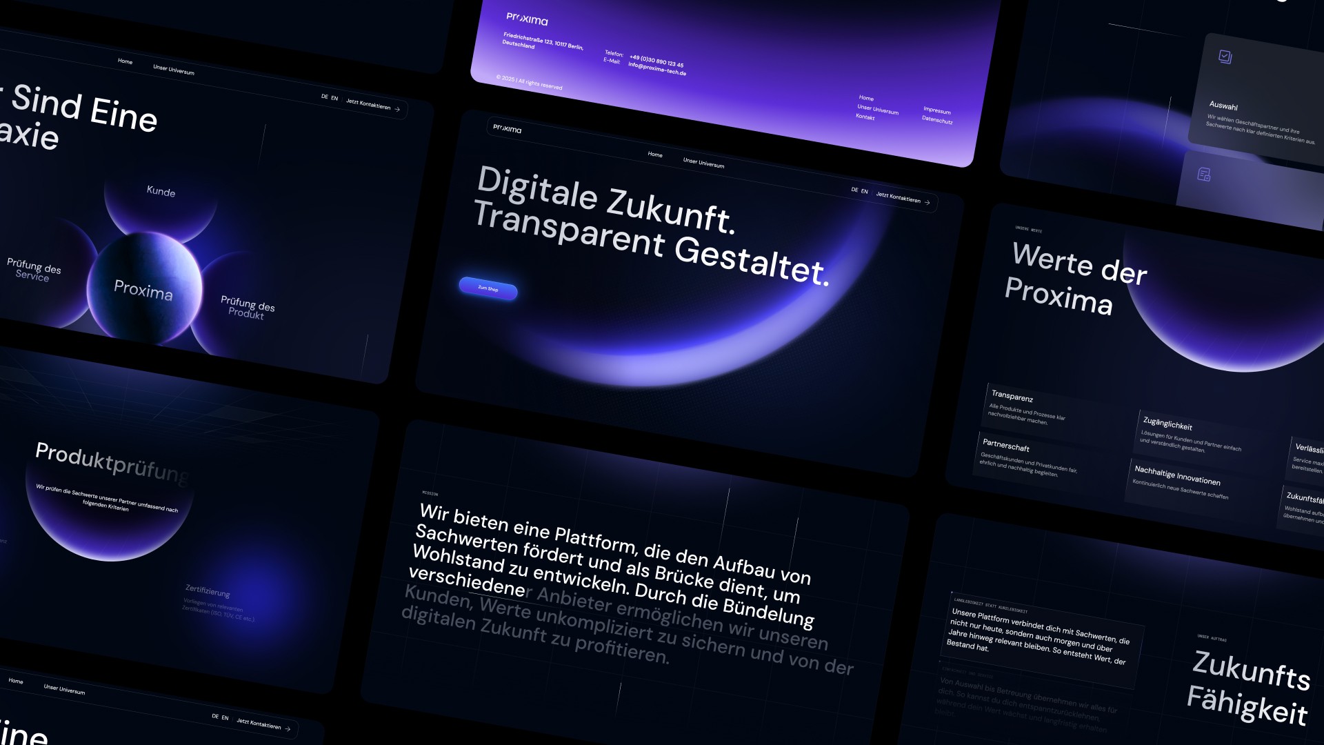
When you study luxury aesthetic websites, one pattern stands out right away: the typography is exceptional. Premium sites use high-quality typefaces with generous sizes, refined letter spacing and carefully balanced line heights. Body text is easy and pleasant to read. Headlines are bold without being pushy.
The choice of typeface alone communicates a lot about your brand. A modern sans-serif like Inter or Satoshi conveys clean professionalism. An elegant serif like Playfair Display signals sophistication and tradition. The worst thing a website can do is use default system fonts or poorly paired typefaces that create visual dissonance.
When it comes to which design elements make a website look good, typography consistently ranks at the top. It is the single most effective element you can improve with the least effort.
White space: less is more
Generous white space is arguably the most characteristic feature of minimalist website design. Cheap-looking websites try to fill every pixel with content, images, banners and widgets. Premium websites do the opposite: they give content room to breathe.
White space is not wasted space. It creates focus, improves readability and gives every element room to communicate effectively. When you look at minimalist website design examples from brands like Apple, Stripe or Linear, you will notice that the spacing between elements is designed just as carefully as the elements themselves.
Understanding how to make a website aesthetically appealing often starts with removing elements rather than adding them. Every component on a page should earn its place. If it doesn't serve the visitor or support the page's goal, it should go.

Color, contrast and visual assets
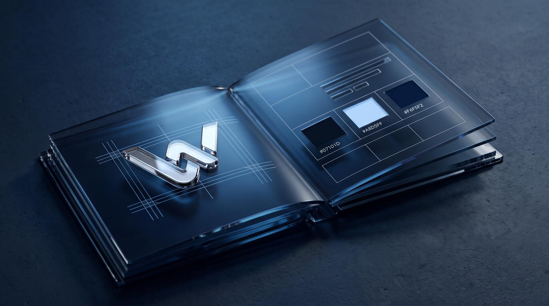
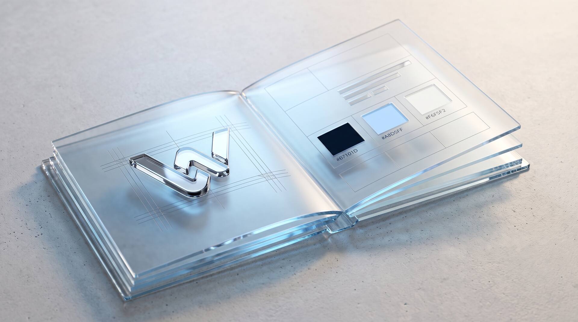
Premium websites use restrained, deliberately chosen color palettes. Typically this means a neutral base (white, off-white or deep navy) with one or two accent colors used sparingly for calls to action and key highlights. This approach creates a sophisticated visual identity that feels coherent and controlled.
Among the most important design elements for websites, color contrast plays a double role: it improves readability and directs attention to the most important elements on the page. A bright accent color on a muted background naturally guides the eye to buttons and links. This improves both aesthetics and conversion performance.
Websites that use too many colors, gradients or clashing tones immediately look amateurish. The discipline of a limited color palette is one of the clearest signs of professional design.
Photography and visual assets
Nothing undermines a website faster than generic stock photography. Premium brands invest in custom photography or carefully curated imagery that feels authentic and fits the brand identity. The images tell a story, support the message and create an emotional connection with the visitor.
When you ask what the essential elements of good website design are, imagery stands alongside typography and layout. The quality of your visual assets directly influences perceived value. A website with beautiful, original images will always feel more high-end than one using the same stock photos found on thousands of other sites.
Micro-interactions, animation and layout
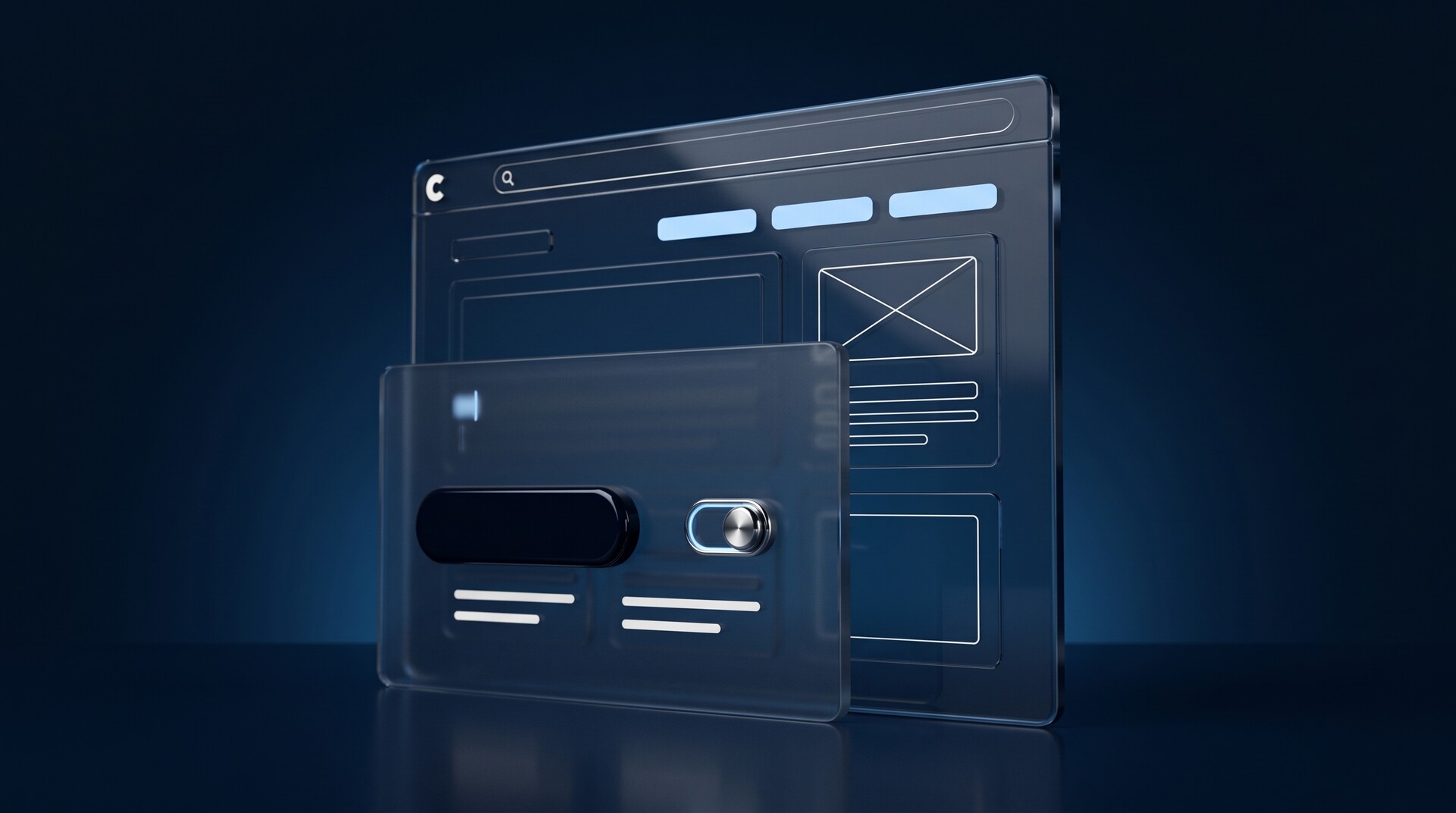
Subtle animations and micro-interactions are what separate a good website from a great one. Hover effects on buttons, smooth scroll transitions, parallax elements and loading animations all contribute to a polished user experience that feels intentional and refined.
Among current website design trends in 2025 and into 2026, thoughtful animations continue to gain importance. The key word is thoughtful: animations should enhance the experience, not distract from it. A smooth page transition that guides the eye to the next section is effective. A bouncing element competing for attention is not.
Understanding how to balance aesthetics and functionality in website design is crucial when using animation. Every animation should have a purpose: directing attention, giving feedback or creating a sense of quality and care.
Layout structure and grid systems
Professional websites are based on consistent grid systems that create alignment, rhythm and visual harmony on every page. Elements align to the grid. Spacing and padding are consistent. Sections flow logically into each other.
A white minimalist website design depends heavily on precise alignment and consistent spacing. When every element is perfectly positioned, the design feels intentional and polished. When alignment is inconsistent, even by a few pixels, the eye notices it, and perceived quality drops.
Building trust through design and why design is positioning
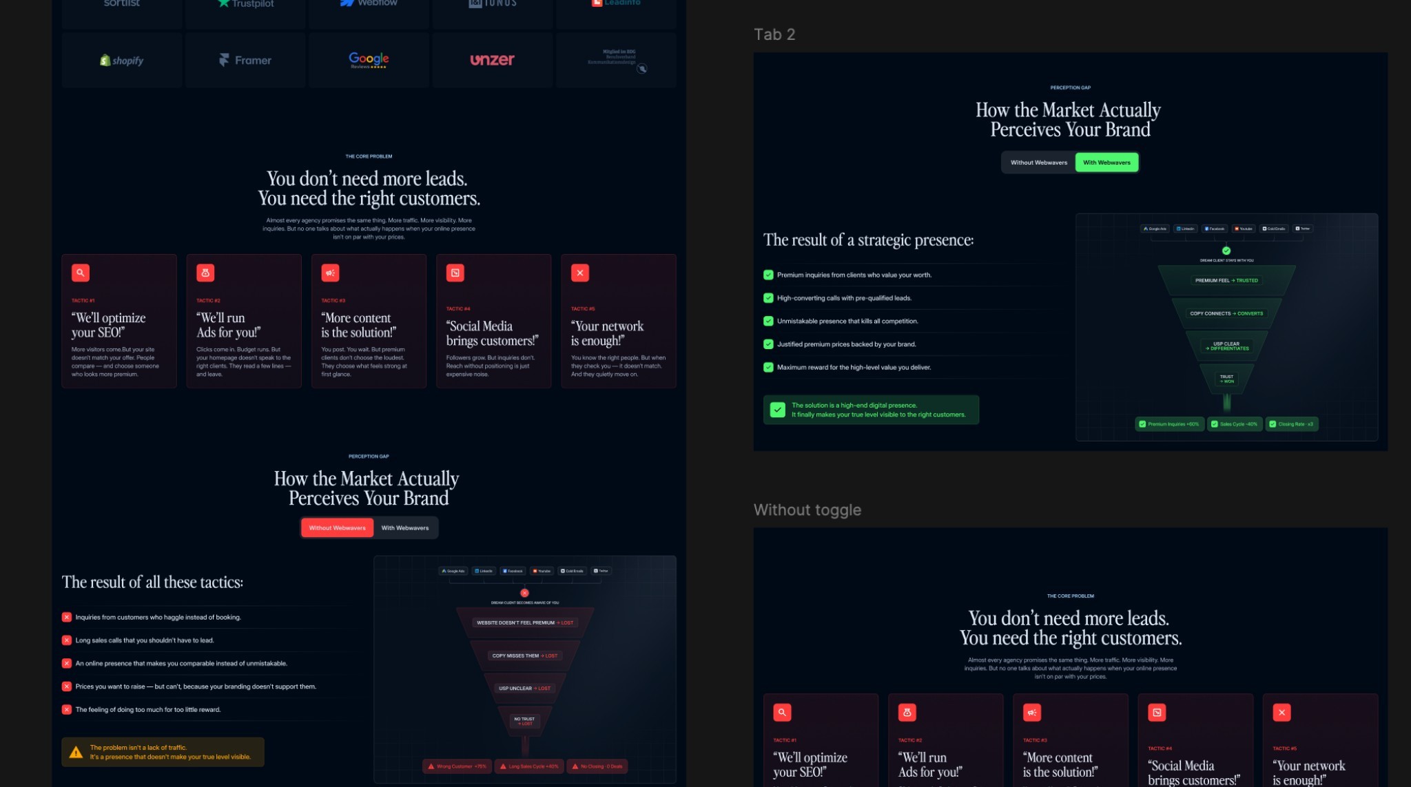
Premium design is not vanity. It is strategy. Understanding how to build trust and credibility through website design means recognizing that visual quality directly influences whether a visitor perceives you as competent, credible and worth their investment.
Trust signals like client logos, testimonials, case studies and certificates play an important role. But they work best when presented in a design framework that already communicates quality. A beautifully designed testimonial section feels more credible than the same quotes in a cluttered, poorly formatted layout.
Your website is often the first touchpoint a potential client has with your brand. The design either confirms the perception that you deliver first-class results, or it creates doubt.
Design is positioning
Every decision about website design elements communicates something about your brand. Typography communicates attention to detail. White space communicates confidence. Color communicates personality. Animation communicates care.
The websites that look and feel high-end are not necessarily the most expensive to produce. They are the ones where every element was chosen with intent, where nothing is arbitrary and where the overall experience feels coherent and refined.
If your website doesn't reflect the quality of your work, it is working against you. Investing in premium design is not an expense but the foundation for how your brand is perceived in every interaction.


More articles