Brand guide: what needs to be in it so it actually gets used

Key takeaways
- A brand guide gets used if it has ten to twenty pages, not sixty.
- It answers application questions, not design philosophy.
- The most important part is the rules for exceptions.
- A guide without templates remains theory. The files are half the battle.
Why most brand guides don't get used
The typical brand guide has forty to eighty pages, starts with a brand story and a values chapter and gets to the logo on page twelve.
It gets read once and then never opened again. Not out of lack of interest, but because it doesn't answer everyday questions.
The questions that actually get asked are: What color is the headline on a presentation slide? How big can the logo be on a pen? What do I do if the logo is on a photo? What font size do I use for an image caption?
A guide that answers these questions in two minutes gets used. One that explains the brand philosophy first gets bypassed, and then everyone decides for themselves.
This leads to the most important rule: A brand guide is a reference work, not a document to read.
The test in twenty minutes
The typical brand guide has forty to eighty pages, starts with a brand story and a values chapter and gets to the logo on page twelve.
It gets read once and then never opened again. Not out of lack of interest, but because it doesn't answer everyday questions.
The questions that actually get asked are: What color is the headline on a presentation slide? How big can the logo be on a pen? What do I do if the logo is on a photo? What font size do I use for an image caption?
A guide that answers these questions in two minutes gets used. One that explains the brand philosophy first gets bypassed, and then everyone decides for themselves.
This leads to the most important rule: A brand guide is a reference work, not a document to read.
What belongs in it
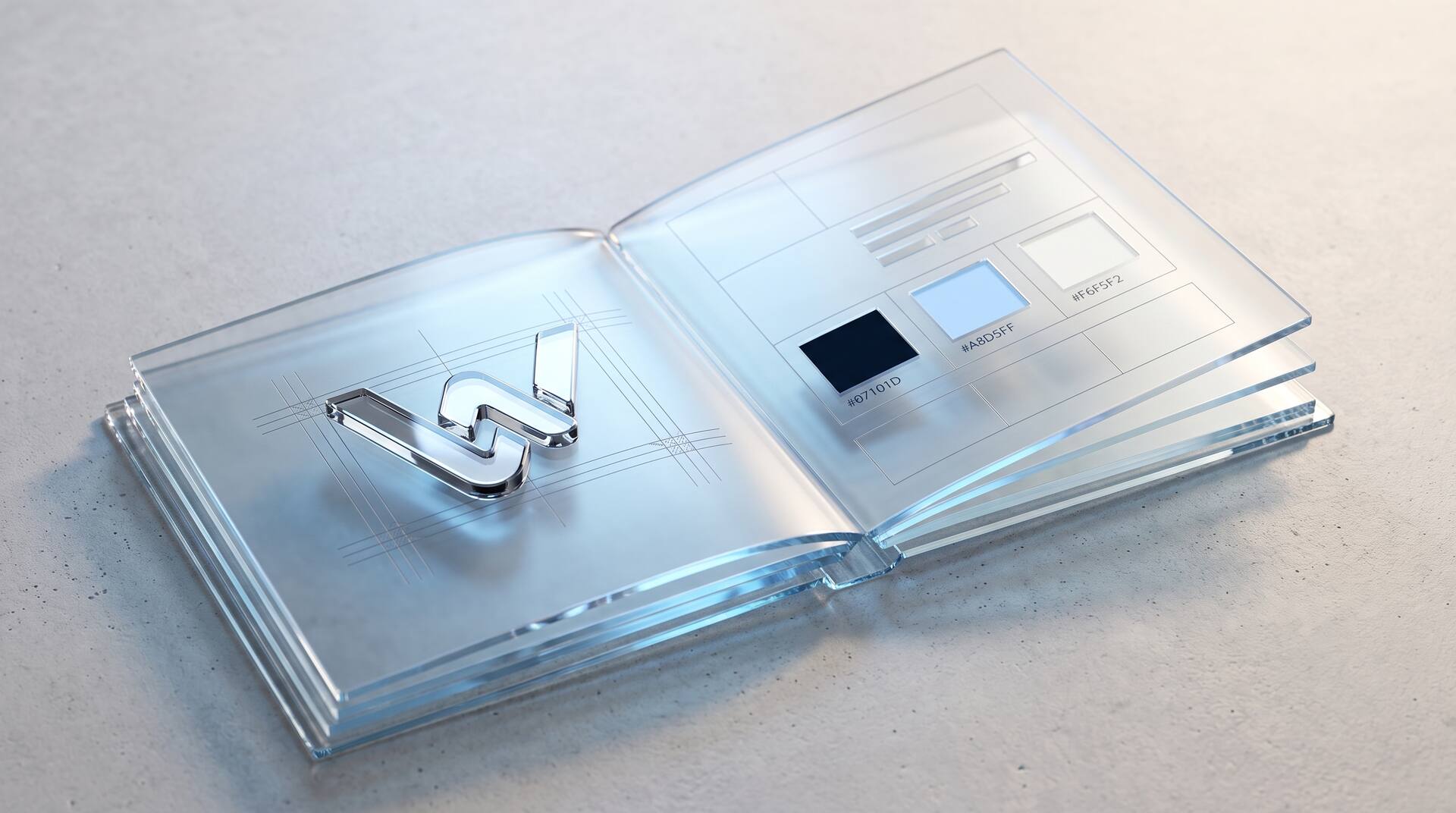
Ten to twenty pages are enough. These chapters:
1. The brand mark. All variants: horizontal, vertical, symbol alone, single-color light and dark. With clear space and minimum size.
2. Misuse. Five to eight examples of what doesn't work: distorted, recolored, with a shadow, on a busy background, too small.
3. Colors. Primary, secondary, functional colors, neutrals. For each color, the values for screen and print and the rule for what it is used for.
4. Typography. Typeface family, weights, size levels with line spacing, and which level is used for what.
5. Imagery. Four criteria, six examples, three counterexamples.
6. Design elements. Grid, spacing, shapes, icons, use of white space.
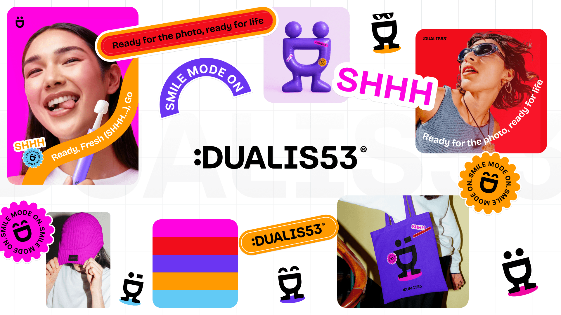
7. Applications. One example each for website, presentation, stationery, social media, signage.
8. Tone of voice. One page: how you write, which words you avoid, three example sentences done right and wrong.
The part that is most often missing
Chapters two to four are in almost every guide. What is missing are the rules for exceptions, and those are exactly what decide whether the system holds up in everyday use.
What happens with very little space? A pen, a favicon, an embroidery. Is there a reduced variant?
What happens on a photo? Does the logo need a surface underneath? Which one?
What happens in a collaboration? Two logos side by side: in what proportion, with what spacing, who goes on the left?
What happens in dark mode? Which color variants apply there?
What happens with a color that isn't in the palette? For example, a client's color in a presentation.
Every one of these questions comes up within the first year. If it isn't answered, people improvise, and the improvisation becomes the standard.
What can be left out
Four chapters that take up space and are rarely needed.
The brand story. Interesting, but not the job of this document. It belongs on the About us page.
The rationale behind the logo. Nobody who is just trying to design a slide reads why the arc stands for movement. If it needs to be documented, then in a separate appendix.
Values and mission statements. They steer the brand, but they belong in the strategy document, not in the application manual.
Extensive design philosophy. The more explanation, the less application.
What deserves the space instead: more examples. A guide with twelve pages of application examples is better than one with twelve pages of text and two examples.
A rule of thumb: if a chapter doesn't help with a concrete design decision, it doesn't belong in it.
The files that go with it
A brand guide without templates remains theory. What needs to be delivered:
Logo files in all variants: SVG for web, EPS or PDF for print, PNG with transparency in several sizes, favicon set.
Presentation template with stored colors, fonts and slide layouts. This is the single most effective file, because presentations are created most often and fall out of line fastest.
Document templates for proposals, invoices and letters.
Email signature as a ready-made block to insert.
Templates for social media in the common formats.
The font files with proof of license, plus a fallback font for cases where the main typeface isn't available.
Plus a storage location everyone knows and can access. A guide that sits as a PDF in an email attachment from 2023 practically doesn't exist.
How to check whether it works
The test is simple and takes twenty minutes.
Give someone without design experience a task. Design a one-page customer information sheet, build a presentation slide, create a social media post.
Watch where they get stuck. Every point where they have to ask is a gap in the guide.
Look at the result. Does it look like you? If so, the system works. If not, either a rule or a template is missing.
Plus a second test after a few months: collect ten materials created in the last quarter and put them side by side. Deviations show which chapters aren't getting through.
And finally: a brand guide needs a responsible person and a date. Without both, it quietly goes out of date. One hour once a year is enough to keep it current, and to add the exceptions that came up during the year.


More articles