From logo to brand system: what really makes an award-winning brand presence
Key takeaways
- A logo is only the beginning
- Brand systems create recognition in everyday use
- Rules make design scalable
- A good brand presence carries across many formats
Why a logo is not yet a brand system
Most brand projects start with the question of the logo. What should the mark look like, which color goes with it, which typeface. These are valid questions, they are just the wrong ones to ask first. Whether a brand works in everyday use is rarely decided by the mark. It is decided by the system behind it.
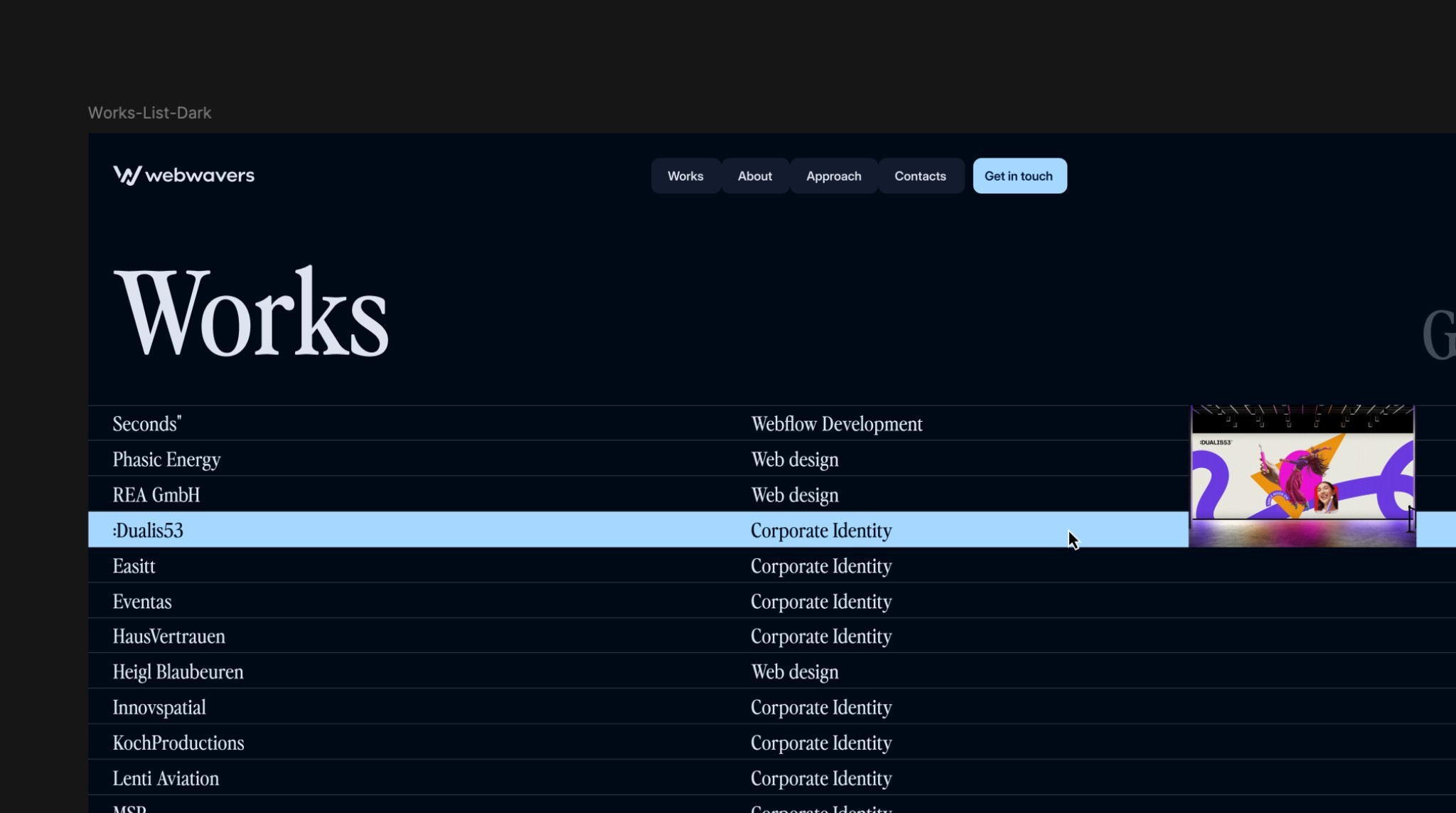
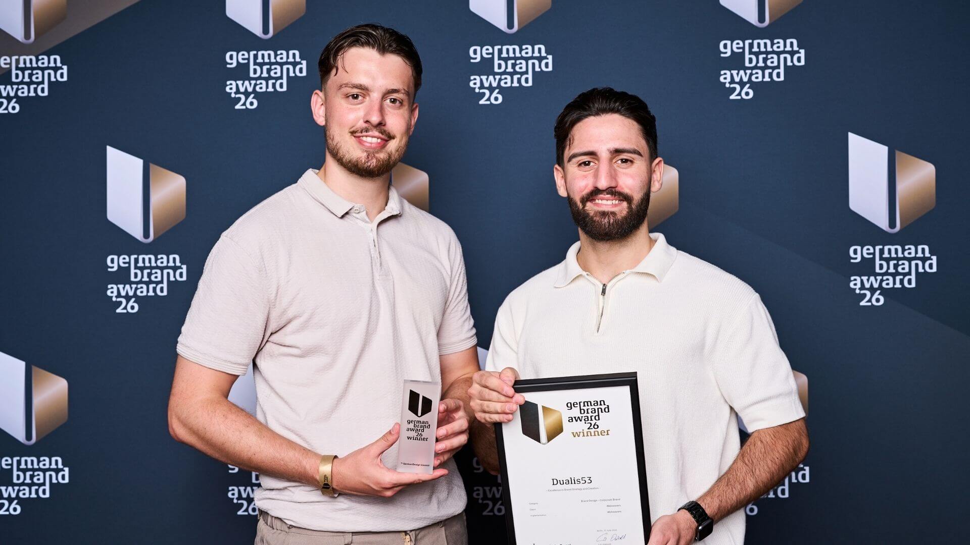
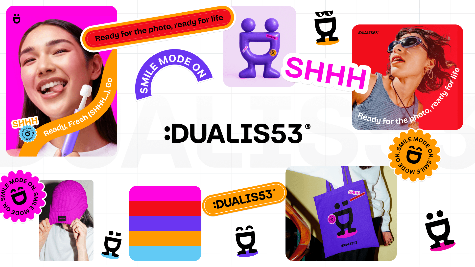
On June 25, 2026, our branding for Dualis53 won the German Brand Award 2026 as Winner at the Uber Eats Music Hall in Berlin. What was recognized was not a logo but the logic beneath it. Using this project, this article explains how you can tell whether a brand presence holds up and what the difference between a successful mark and a robust system means in practice.
A logo carries the name. A brand system carries the brand. You don't notice the difference with the first draft, but when the tenth format is done and still feels right.
Most brand projects start with the question of the logo. What should the mark look like, which color goes with it, which typeface. These are valid questions, they are just the wrong ones to ask first. Whether a brand works in everyday use is rarely decided by the mark. It is decided by the system behind it.
On June 25, 2026, our branding for Dualis53 won the German Brand Award 2026 as Winner at the Uber Eats Music Hall in Berlin. What was recognized was not a logo but the logic beneath it. Using this project, this article explains how you can tell whether a brand presence holds up and what the difference between a successful mark and a robust system means in practice.
Why a logo alone is not yet a brand
A logo is quickly judged. You either like it or you don't. This very simplicity is misleading, because the problems only arise afterwards, when the brand has to do its job.
A mark can only ever say one thing
A logo has a fixed form and therefore a fixed message. But a brand has to sound different depending on the situation. A job ad needs a different tone than product packaging, a promo badge in an online store a different one than the sender of an invoice. If all you have is a mark, you solve this with text and give away the impact the visual side could have.
Every new format forces decisions nobody has made
As soon as the first Instagram post comes up, the first roll-up banner, the first packaging, questions arise that weren't answered in the logo design. How big can the mark get, which color carries the background, what does the brand look like in motion? Without a set of rules, each of these questions gets decided individually, usually under time pressure and usually by different people.
Without rules, every application becomes a negotiation
What happens when three agencies, a printer and your own marketing department use the same brand without it being defined how? Everyone makes plausible individual decisions. Together, they produce a presence that nobody decided on that way and that nobody can bring back.
The brand frays without anyone noticing
The loss doesn't happen in one day. It happens over two years, in small deviations that were each justifiable on their own. In the end, there is a presence that looks a little different everywhere, and the question of why the brand doesn't work even though the logo is good.
Growth makes the gap impossible to overlook
As long as a company has one website and one business card, a missing system goes unnoticed. As soon as channels, products or locations are added, it gets expensive. Then every new application costs coordination, because there is no foundation everyone can refer to.

The character system principle
For the Dualis53 project, the basic decision was to treat the mark not as a finished image but as a construction kit. That sounds abstract, but the result is very concrete.
A letter becomes a figure
The D in the wordmark didn't stay a letter. With a few graphic elements, eyes, eyebrows, small accessories, it becomes a figure. Not just one, but a whole series. The letter always stays recognizable, it just gets an expression added.
One element, many moods
This lets you convey attitude without anyone having to read a text. Friendly, attentive, reserved: these are no longer adjectives in a brand manual but visible states of the same element. For channels where nobody reads and everyone just scrolls, that is the difference between being noticed and being overlooked.
Recognition without repetition
The usual path to recognition is repetition: the same mark, everywhere, always the same. That works, but it gets tiring. A character system achieves recognition through the principle instead of through repetition. You recognize the brand even though you have never seen this specific version before.
Why this is not design for its own sake
A system like this saves money in day-to-day operations. It answers questions in advance that would otherwise have to be settled individually every time. If you need a new application, you draw on a rule instead of a discussion.
Typeface, color and the rules behind them
A character system alone doesn't carry the brand yet. It needs the second level: typeface and color as decisions with a rationale, not as a matter of taste. Five points, in this order.
Step 1: Choose a typeface that has an attitude
For Dualis53, it became Bricolage. A typeface is never neutral, it always brings a tone with it. So the question is not which typeface is beautiful, but which one fits what the brand wants to say, and whether it is available in all the weights and sizes needed.
Step 2: Allow more than one color
Instead of a single brand color, Dualis53 has a palette of five bold colors. That is less convenient because it requires decisions, but it gives the brand room to move. A single brand color makes every second application look the same and every third one boring.
Step 3: Give every color a job
Five colors without rules are not a system, they are arbitrariness. The real step is the assignment: Which color carries surfaces, which sets accents, which is reserved for warnings, which combinations are excluded. Only this assignment turns a palette into a set of rules.
Step 4: Test the system on the hard cases
A lot looks good on screen. The real test comes elsewhere: on packaging, in motion, in print, at a trade fair booth. In the Dualis53 project, the system was carried all the way through to the packaging, which comes in several variants. What works there also works on the website.
Step 5: Write down the rules so they work without you
A system that only exists in the designer's head is not a system. It needs to be documented, with examples for the standard case and for the exception. The benchmark is simple: Can an outside agency work with it without asking questions?
How to tell whether your brand presence holds up
Five questions for your own brand presence
Can you convey three different moods without changing the logo? Does an external service provider know without asking which color is used for what? Does your brand look the same in motion as it does standing still? Does it work on packaging or only on screen? And would you have to decide a new application yourself today? If more than two answers are uncertain, what you are missing is not a logo but a system.
What an award says about this and what it doesn't
A German Brand Award doesn't prove that a brand generates revenue. It shows that a jury of experts judged the work to be consistent and distinctive. For us, the award is above all a confirmation of the direction: thinking of brands as systems rather than one-offs pays off, even if it is the more demanding path in a project.
Conclusion
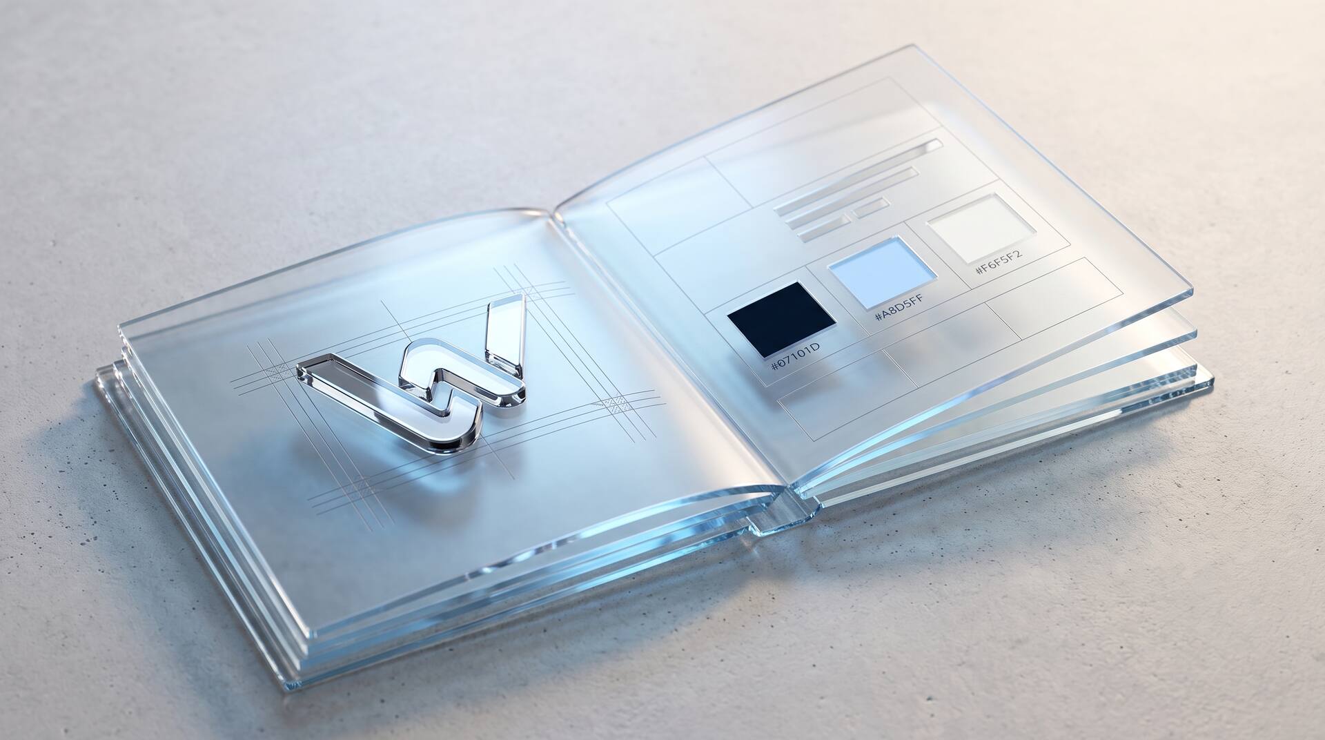
A logo is the beginning, not the result. What carries a brand presence are the rules behind it: an element with several states, a typeface with attitude, a palette with clearly assigned jobs and documentation that works even without the original designer.
If your brand gets renegotiated with every new application, it is rarely down to the mark. What is missing is the system beneath it. And that is a problem that can be solved.


More articles