SEO & GEO
Visibility that keeps growing.
Clean structure, fast technology and content that Google and AI search understand.




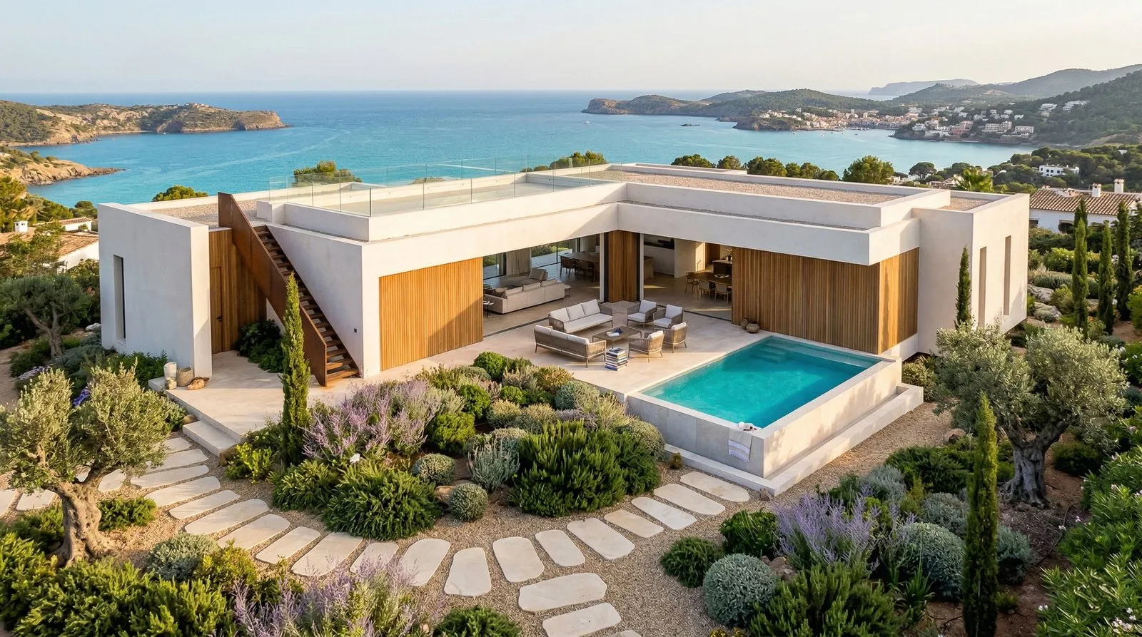
The visual identity of Palmera Hills stands for private estate management at the highest level. It reflects a holistic view of property care, where responsibility, discretion and long-term value preservation guide every decision.
Rather than a conventional rental or property service, the identity positions Palmera Hills as a private partner for discerning owners. Understated design, balanced proportions and a timeless aesthetic convey trust, control and quiet authority, free of trends and superficial luxury.

The proportions and construction of the wordmark convey stability and confidence, supporting its positioning as a premium partner in private estate management. Precisely controlled spacing and fine details create a calm, assured presence.
As a result, the logo feels exclusive without being rigid or playful, and carries the brand through typography alone in many applications.
Manrope works cleanly on screen and in print alike. Its clear structure ensures legibility and consistency online while meeting the standards of high-quality print materials.
It forms an elegant contrast to the wordmark that strengthens hierarchy and balance across the whole identity. In headlines and short statements in particular, it underlines the premium character. Drag the slider to see the font weights.

The symbol unites the core elements of the name in a single, self-contained mark. Rather than relying on literal imagery, it builds meaning into the construction itself.
The H carries the silhouette of a roof and stands for the properties in their care, while the central element forms a stylised palm as a subtle nod to the Mediterranean. The surrounding frame stands for stability, protection and care.
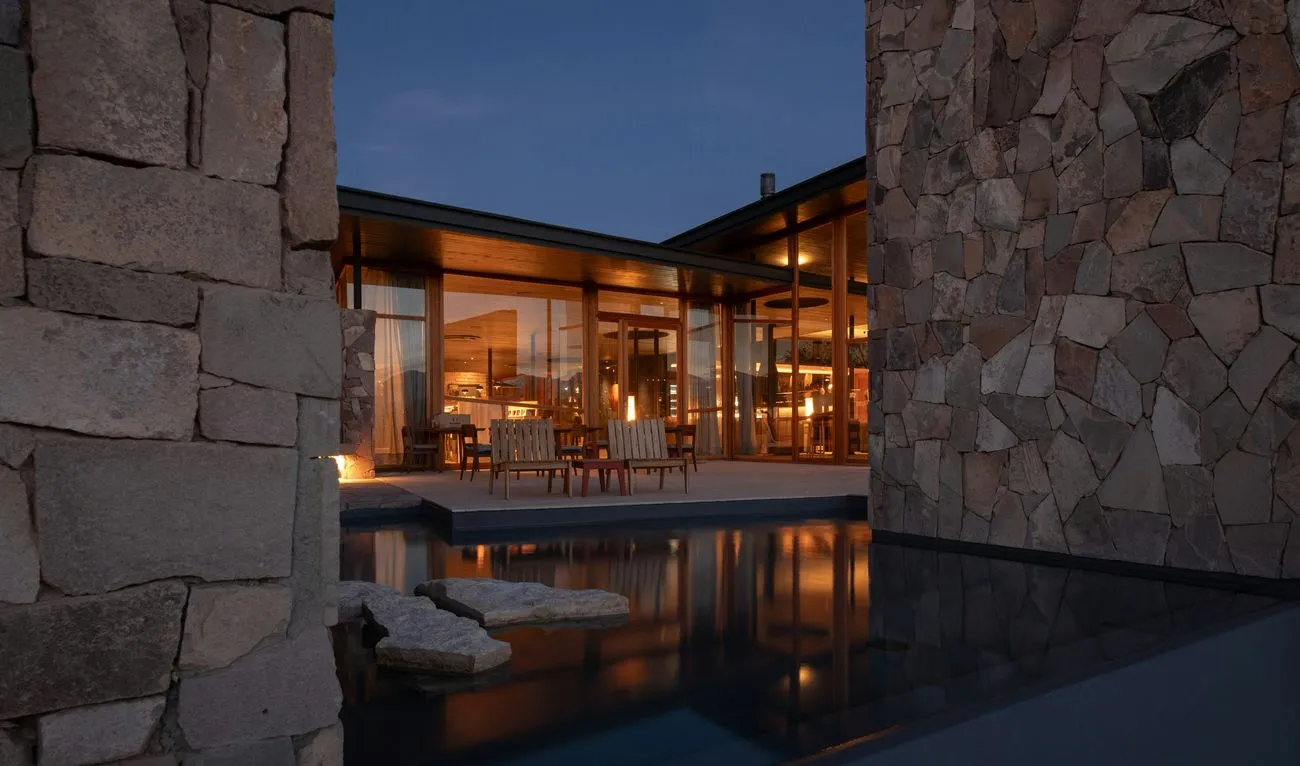
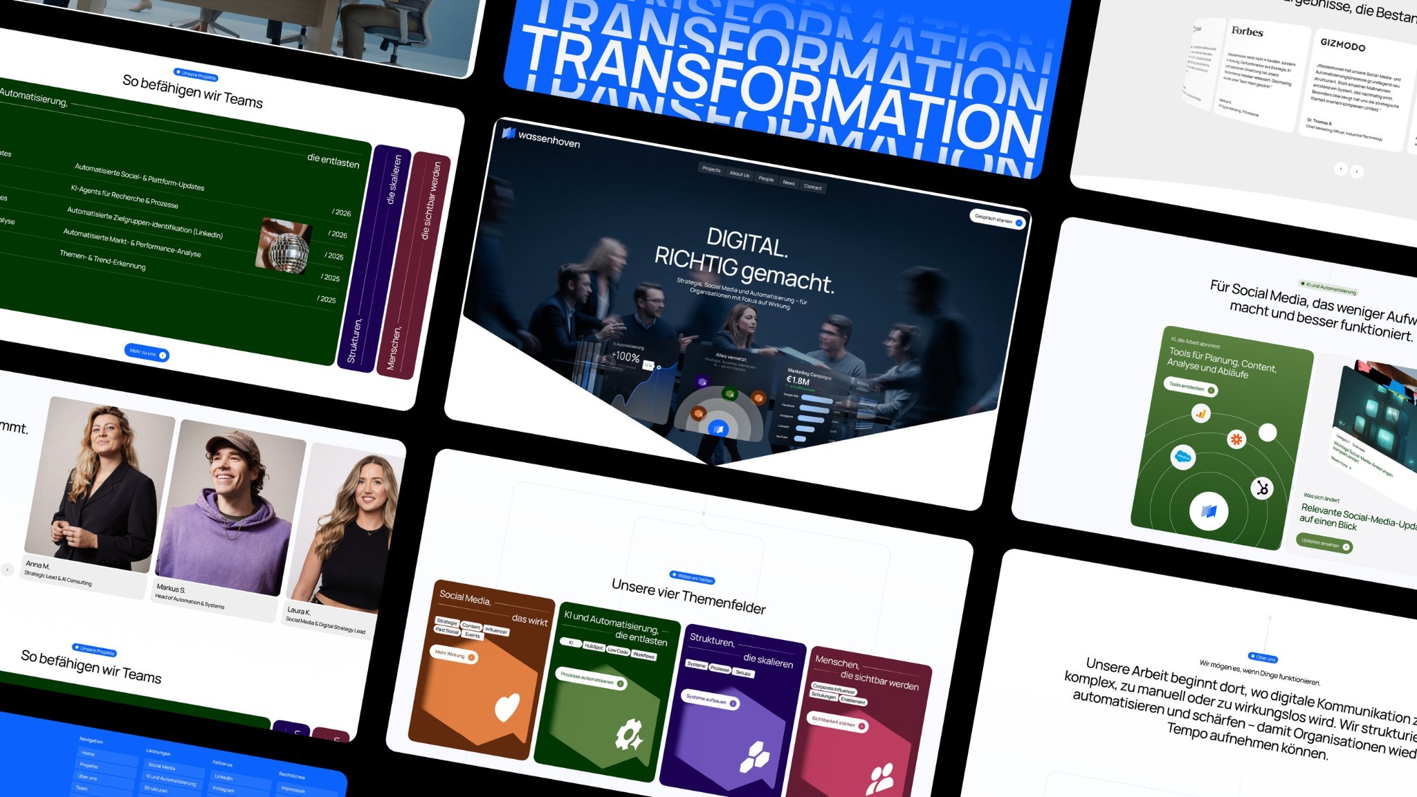
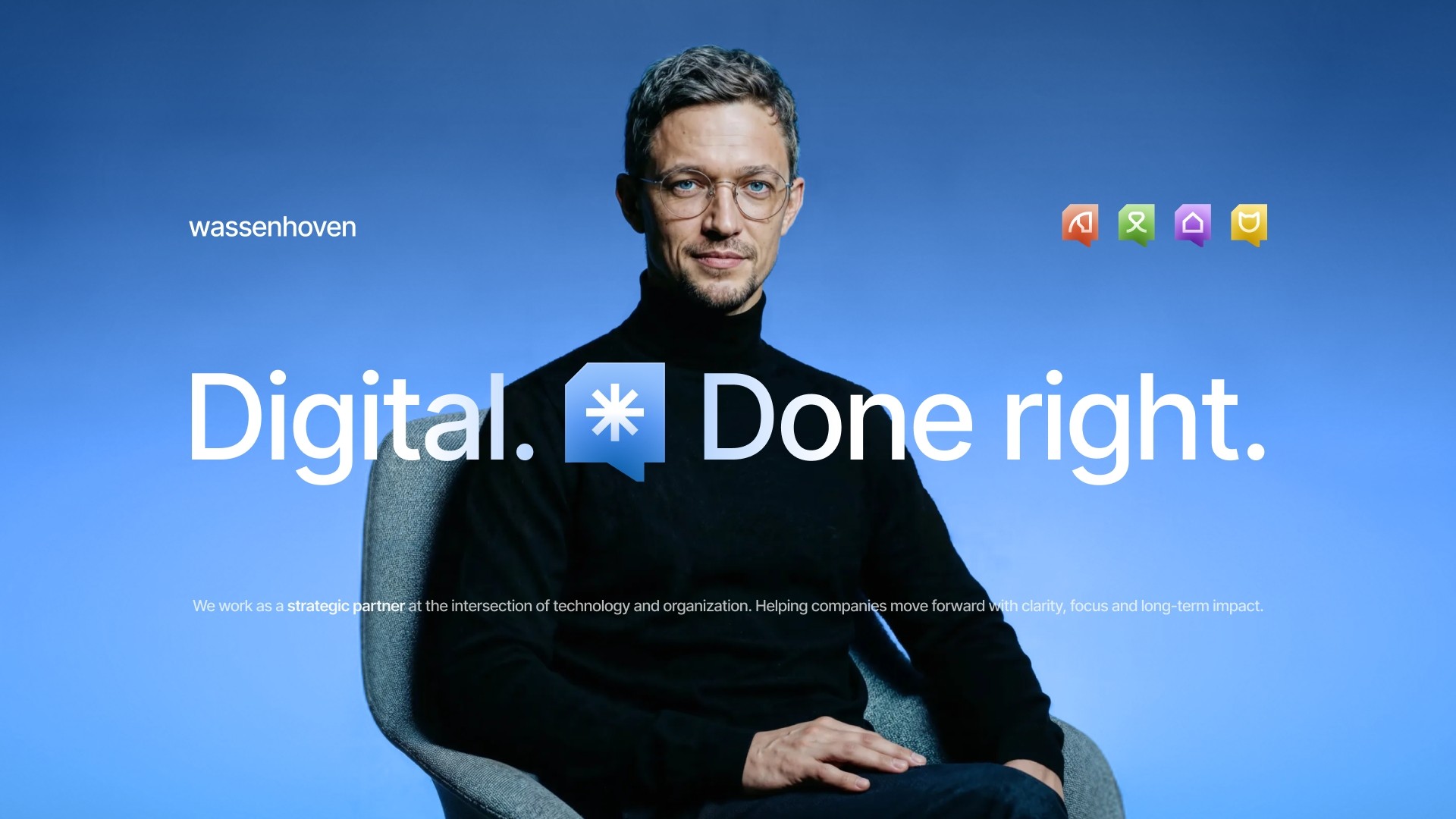
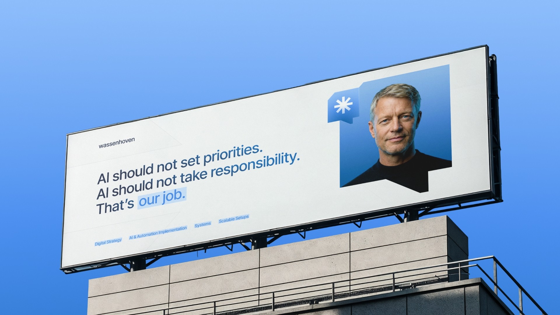
For Wassenhoven, we developed a corporate identity that unites technology, organization and human responsibility in a clear, contemporary brand structure. The starting point of the branding is a deliberate stance: digital transformation is not an end in itself but a tool for sustainable progress. The visual concept translates this positioning into a reduced, functional and concise design language that conveys orientation, clarity and trust. The look is modern, calm and controlled and deliberately avoids visual clutter or short-lived trends. This positions Wassenhoven as a strategic partner at the intersection of technology and organization.
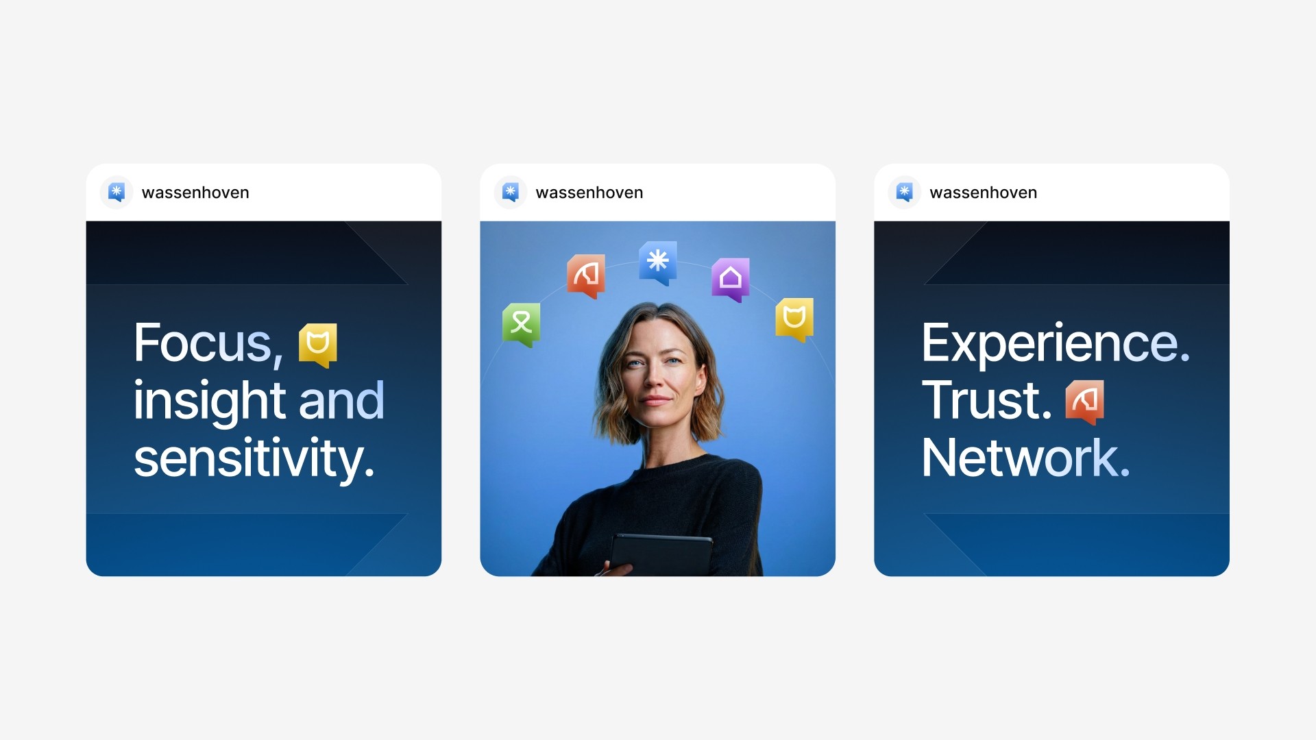
The Wassenhoven branding is conceived as a modular system that puts clarity, consistency and long-term usability at the center. Logo, symbolism, typography, gradients and sub-brand structures interlock logically and enable differentiated yet cohesive brand communication.
The visual identity supports complex content without dominating it and creates a clear structure across all digital and physical applications. The result is a brand that makes technology understandable and visibly takes responsibility, today and in the future.
A company that deliberately operates behind the scenes still needs presence.
A timeless identity with quiet authority instead of loud luxury.
The brand has to work on screen, in print and on physical objects.
A brand system of wordmark, symbol, typography and colour palette for every touchpoint.
Feeling premium without tipping into superficial luxury aesthetics.
Reduced forms, considered typography and a clear colour system carry the positioning.
Building trust with owners, investors and partners.
A recognisable brand presence as the foundation for further growth.
Many services and regions that each need to be found.
9 service pages and 7 region pages with a clear structure.
Showing a broad offering without overwhelming visitors.
A mega menu that organises all services into three groups.
Making enquiries possible without detours.
3 ways to enquire on the contact page, including a property check.
Carrying the calm of the brand onto the web.
Custom, lightweight scroll animations instead of heavy effect libraries.
I searched for a very long time for someone like Edip and, of course, his team. For our project and our company, Webwavers was a truly great experience and a real asset. I can recommend him and the team 100% and hope for a long collaboration.



Clean structure, fast technology and content that Google and AI search understand.
Performance, accessibility, best practices and SEO, measured with Google PageSpeed Insights.
Dedicated contacts and full visibility of where your project stands at any time.
Core Web Vitals in the green, so visitors stay rather than bounce.
Measured with Google PageSpeed Insights: performance, accessibility, best practices and SEO.