



Web design for research and science
For institutes, research projects and spin-offs that want to make their work understandable and win partners, funders and talent.





What matters in research and science
What your target audience really expects.
A research website speaks to many people at once: fellow experts, funders, industry partners, politics, press and future employees. Each group is looking for something different, and all of them expect to find it and understand it quickly. On top of that come accessibility, several languages and an editorial team that maintains the site alongside day-to-day work.
Many target groups, clear entry points
Those who want to fund look for impact. Those who want to cooperate look for expertise and contacts. Those who apply look for the work environment and open positions. A good structure leads each group straight to its content.
Complex topics in clear words
Core message first, then technical depth. That way the public and politics understand what it's about, and experts still find all the details. Graphics and animations explain what text alone can't.
Accessible from the start
Contrasts, font sizes, keyboard navigation, alt texts and a clean heading structure are part of the basic setup. For many publicly funded institutions, this is mandatory anyway.
Make funders and partners visible
Funding notices, funder logos, consortium partners and project durations belong neatly on every project page. That meets requirements and at the same time shows how well connected you are.
Order in organically grown content
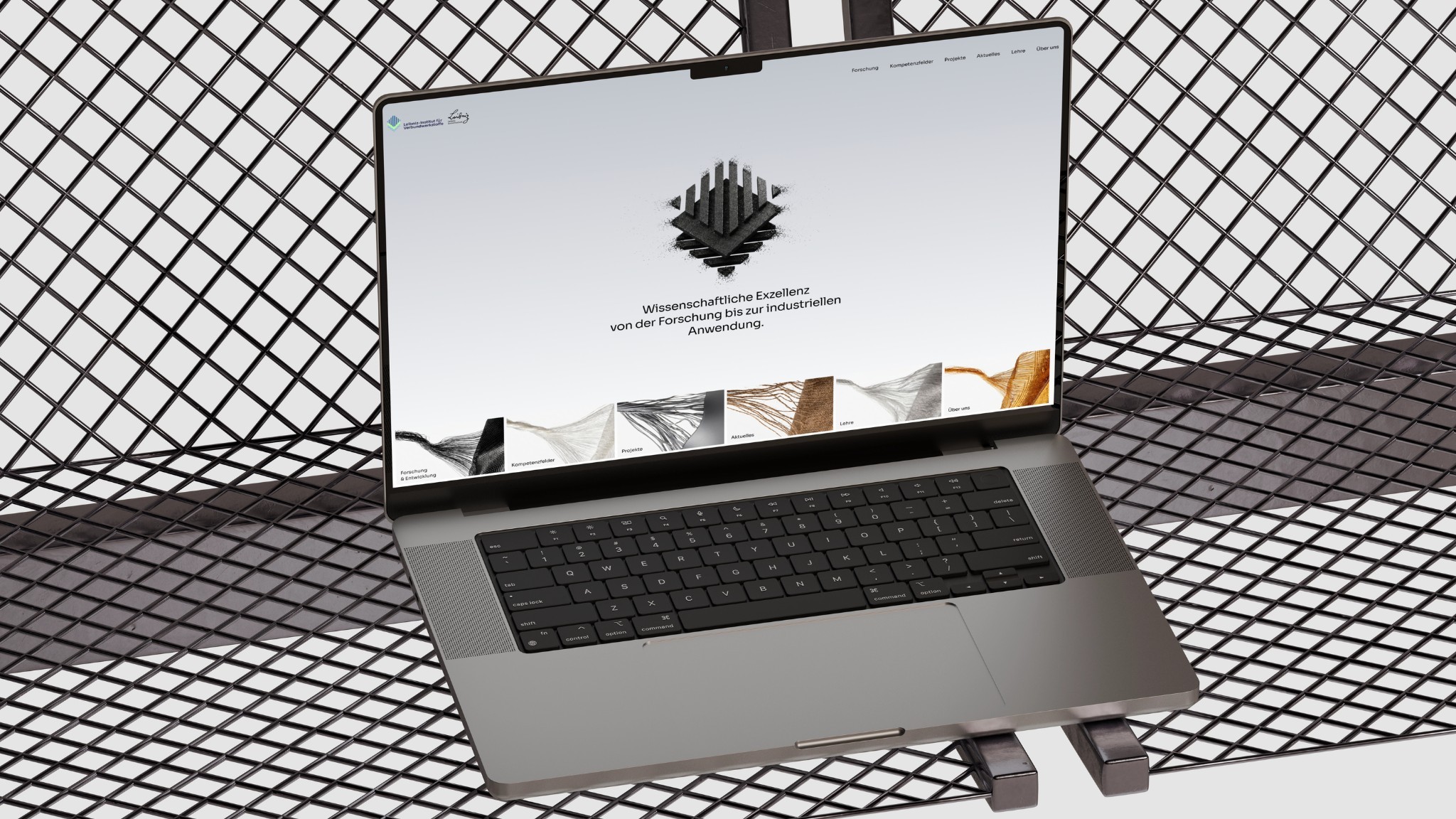
Departments, program areas, projects, publications: over the years, a maze quickly emerges. For the Leibniz Institute for Composite Materials, the focus was on presenting program areas, fields of expertise and projects clearly.
German and English cleanly separated
International partners and applicants expect a full English version. That includes separate URLs per language, a clear language switcher and SEO settings for every language.
Easy to maintain for the editorial team
Your communications team maintains news, projects, publications and jobs themselves, without code and without breaking the layout. The CMS adapts to your content, not the other way around.
Credible, but not distant
A presence that radiates scientific rigor and still feels inviting. For VALO28, the existing logo was kept and expanded into a modular brand system for digital, print and spatial applications.
Why good research often gets lost online.
Too much jargon
What's obvious to fellow experts isn't understood by politics, business and the public. The impact of your work stays invisible.
Organically grown structures
Projects, departments, publications: over the years, a maze of pages emerges in which nobody finds what they're looking for.
Many stakeholders, little time
Coordinating with management, communications and project partners makes website projects drag. You need a process that brings everyone along.
Making science understandable and visible.
We reorganize content, translate research into clear messages and design a presence that combines credibility and accessibility. With a structured process that makes coordination easy and a CMS for projects, news and publications.
Start a projectResearch & science case studies
Projects from your industry that speak for themselves.
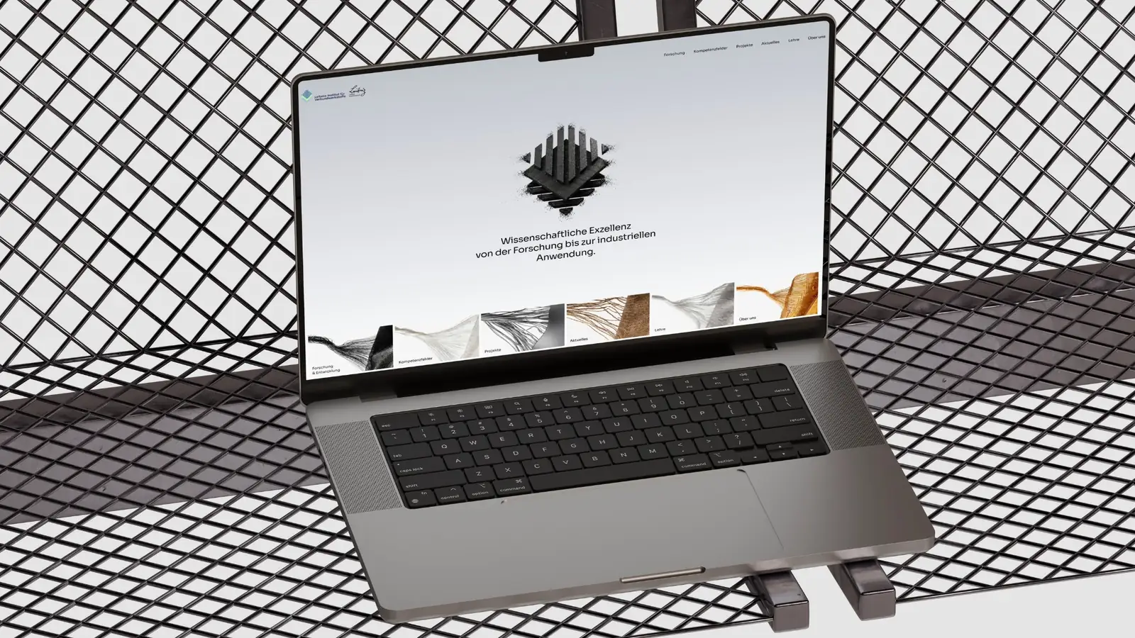
Leibniz-Institut
Research & Science · 2026
Built entirely in Webflow: a clear page structure, fast loading times and a flexible basis for future extensions.
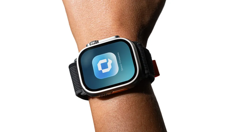
Qarevo
Research & Science · 2026
Identity for a digital health platform: a symbol built from the letter Q as the cycle of care, with a color palette between reliability and progress.
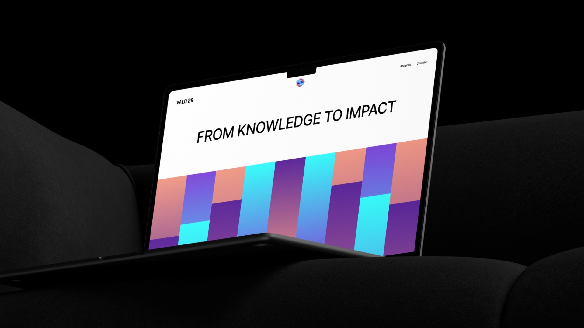
Valo28
Research & Science · 2026
Research content made accessible, combining high standards and clarity.
Services in detail
What we build for research and science.
From information architecture to training the editorial team. These are the building blocks we typically deliver for institutes, research projects and spin-offs.
Navigation by target groups and topics
We sort content by how visitors search, not by the org chart. Entry points for funders, partners, press and applicants complement the thematic navigation.
Pages for program areas and fields of expertise
Every area gets its own page with core message, focus areas, ongoing projects and contacts. That makes visible what you can do and who stands behind it.
Project database in the CMS
Projects with duration, funder, consortium partners and results as a CMS collection, filterable by topic or status. Your editorial team adds new projects themselves.
Publications, news and press
A section for announcements, events and publication lists, with links to repositories if you like. Press contact and image material are where journalists look for them.
Graphics and motion that explain
Diagrams, icons and animations make processes, materials or workflows tangible. We use motion deliberately so that it explains and doesn't slow down loading times.
Accessible build
We plan semantic HTML, a logical focus order, sufficient contrast and alt texts from the start. We'll clarify together in the concept phase which requirements apply to your institution.
Careers and research groups
Jobs, doctoral and thesis positions as a CMS list, plus pages that show research groups and the work environment. That way you attract talent who know what they're getting into.
Relaunch and migration
We move organically grown websites, for example from TYPO3 or WordPress, in an orderly way. Content is sorted and old URLs are preserved via redirects so that links from publications don't lead nowhere.
Why This Process Wins
Why This Process Wins
Why This Process Wins
Built on clarity. Not on assumptions.
Strong results are no accident. They are the product of structure, depth, and intentional choices.
01
Strategy before visuals
We define positioning and direction first. Design decisions are never random.
02
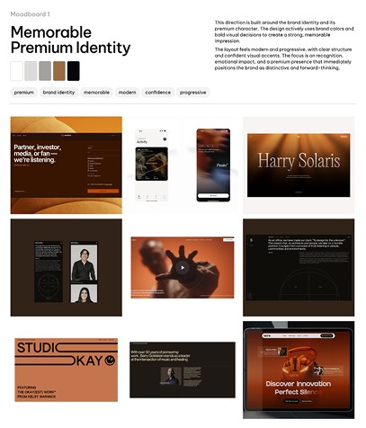
Early validation
You see mood boards and key sections before the full rollout. Alignment happens early, not after weeks of work.
03
Tailor-made, not a template
Every project is built from the ground up. No recycled systems. No shortcuts.

04
Craftsmanship meets technology
Premium design implemented with clean, modern development. Performance and aesthetics go hand in hand.

Collaboration you can plan on.
We work efficiently without rushing quality.


Private Slack channel
Every client gets their own Slack channel. Fast feedback. Transparent communication. Direct access to the team.


Dedicated project manager
A clear point of contact. Structured updates. Focused coordination across design and development.


Transparent progress
Clear phases. Clear results. You always know where we stand in the process.


Feedback at every stage
Every milestone includes review rounds. Nothing moves forward without your approval.
Clarity instead of assumptions.How your project works.
Create structure
We sort projects, topics and target groups and develop a navigation in which everyone quickly finds what they're looking for.
Translate research
Clear copy, graphics and motion make complex topics tangible for funders, partners and the public.
Clean handover
A Webflow CMS for projects, publications and news that your team can work with independently.
Start a projectClient Testimonials
What our clients say about working with us.
„Webwavers hat unser Erscheinungsbild strategisch weiterentwickelt und die Website ohne eine einzige Rückschleife umgesetzt. Der Prozess war kompetent, strukturiert und die Kommunikation jederzeit auf höchstem Niveau. Absolut empfehlenswert.“
„Webwavers hat es geschafft, unser komplexes Beratungsangebot visuell auf den Punkt zu bringen. Unser Auftritt wirkt jetzt sofort professionell und auf Augenhöhe mit unseren Kunden. Die Zusammenarbeit war strukturiert, effizient und wir hatten jederzeit denselben Ansprechpartner.“
„Vom ersten Gespräch an war klar, dass hier strategisch gedacht wird. Marke und Website wurden komplett neu aufgestellt — und das Ergebnis spricht für sich. Potenzielle Kunden verstehen sofort, wer wir sind.“
Reviews
What our clients say about working with us.
Excellent websites.
Webwavers won the German Web Award 2025 and was honored with the German Design Award 2026.
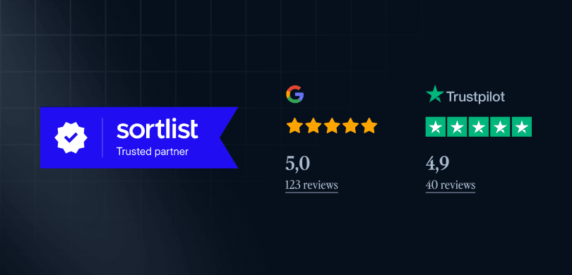
4.9-star average.
150 public reviews on Google, Trustpilot, and Sortlist from companies across the DACH region and around the world.

Marvin Nitschke
CEO, Selobia GmbH

"Branding and corporate identity at the highest level. The team obsesses over every detail until everything is just right—they don't just execute ideas, they critically refine them. The communication, speed, and quality are unlike anything I've experienced before. An absolute recommendation."
Dr. Clemens Striebing
Fraunhofer IAO
"Webwavers took our brand identity to the next level and delivered the website without a single revision loop. The process was professional and structured, and the communication was top-notch throughout. Highly recommended."

Alexandra Wassenhoven
CEO, Wassenhoven UG
"From our very first conversation, it was clear that they think strategically. Our brand and website were completely overhauled—and the results speak for themselves. Potential clients understand exactly who we are right away."

Fabian Herrmann
Marketing, BMI Lab AG

"Webwavers managed to distill our complex consulting services into a sharp visual identity. Our presence now feels immediately professional and on par with our clients. The collaboration was structured, efficient, and we had the same point of contact throughout."
Zeljko Branovic
CEO, FischerAppelt AG
"Strong ideas, clear execution, and a result that is truly convincing. Webwavers understands what an agency at our level needs. I look forward to the next project."

Nawid Rafiq
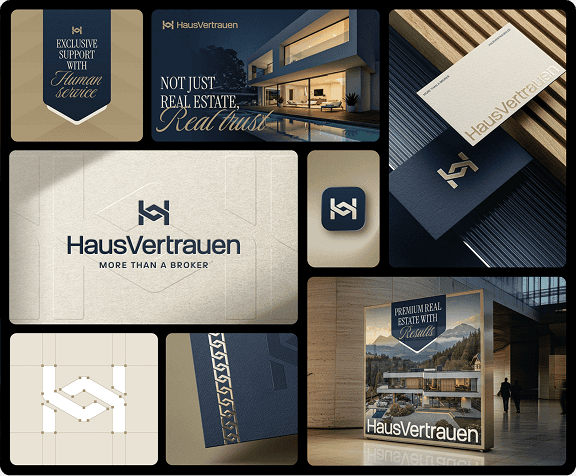
CEO, HausVertrauen
"Finally, a presence that radiates the trust we promise our customers every day. The branding and website integrate perfectly — the result clearly exceeded our expectations."

Vikar Ahmed
CEO, AV Gems
"20 years of craftsmanship deserve a brand that makes that visible. Our rebranding and website now perfectly reflect what we stand for — timeless, precise, and with a strength that doesn't need to be loud."

Marius Gotta
CEO, Atoria Immobilien GmbH
"If you want to attract premium clients in the real estate market, you need a presence that communicates that immediately. That is exactly what Webwavers delivered — visually striking, strategically sound, and of a quality that speaks for itself."

Marvin Trick
CEO, Dualis53 GmbH
"The team genuinely understands what it means to develop a site that is easy to maintain afterwards. Very satisfied — would do it again without hesitation."

Claire F.
Marketing, Lenti Aviation GmbH
"A brand that immediately speaks to the right audience—calm, exclusive, and at the level of our clients from the very first glance. The result completely convinced us."
Numbers and awards
Proven, not just claimed.
Reviews, awards, and partner statuses that you can verify at any time.
Companies from the DACH region and around the world trust Webwavers.
completed projects in branding, web design, and development.
GoogleStars from 95 Google reviews.
Awards and accolades, including the German Design Award 2026 and German Brand Award 2026.






Webflow Premium Partners in Germany.
All awards
To the awards page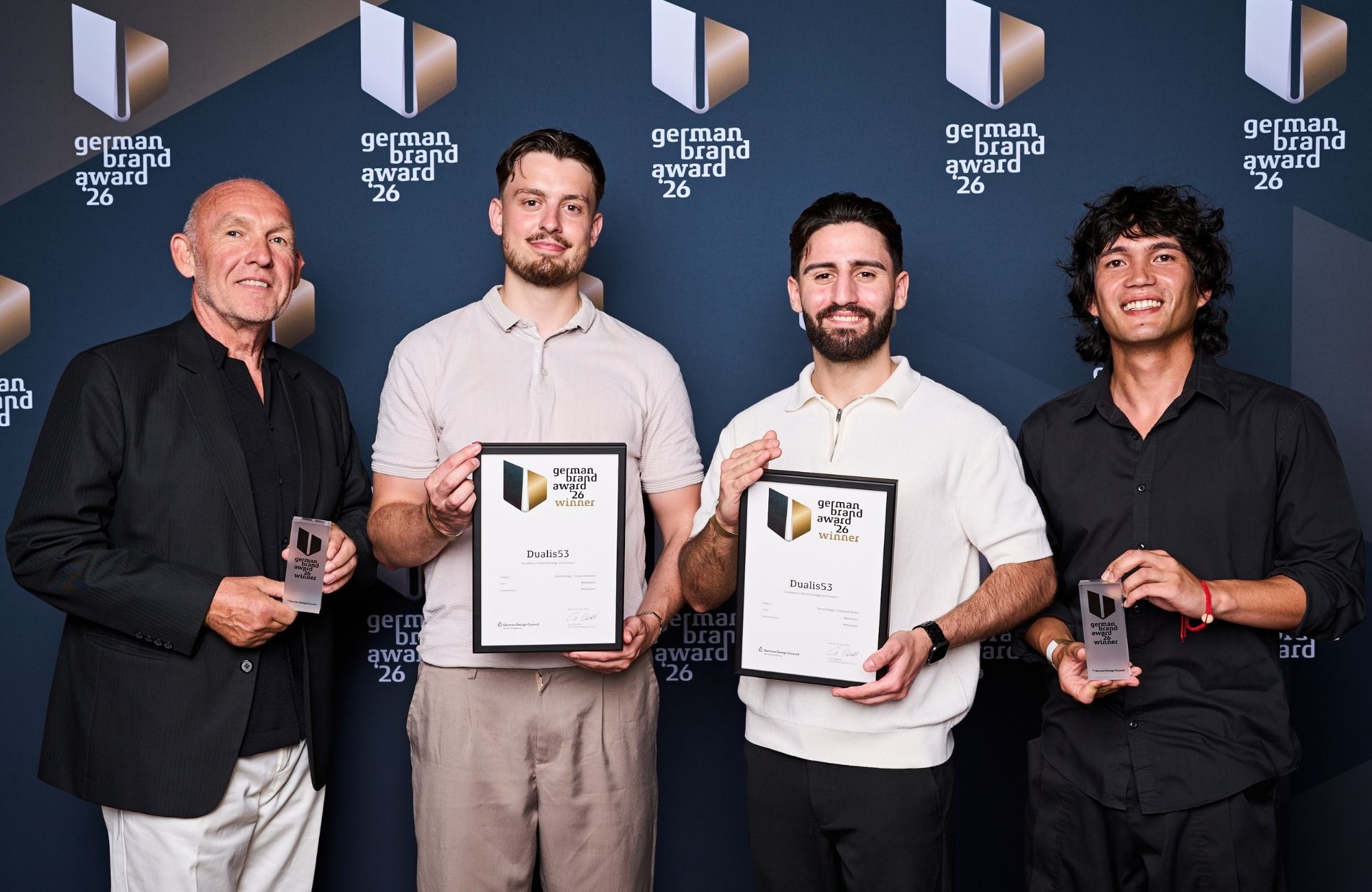
We are so confident in our work that we reduce your risk to zero.



If you are not completely convinced after seeing the mood boards and the first design sections, we will refund your deposit in full. This guarantee exists to eliminate your risk. It has never been redeemed.

Guides and videos
Knowledge for research & science.
Practical knowledge from our projects: articles and videos that fit your industry.

BFSG: what the accessibility requirement means for your website
Blog

How many pages does a company website need?
Blog

Planning a website relaunch: the process in 7 steps
Guide
Explained on video
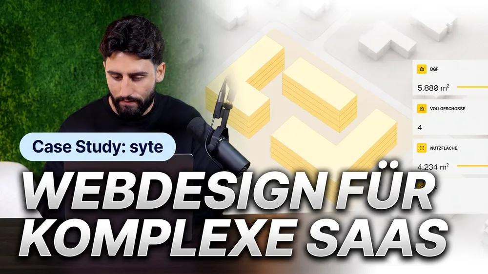
A SaaS website hero that explains your software instantly
12:10
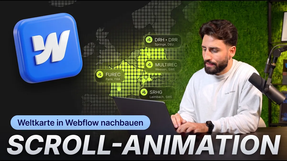
Scroll animation in Webflow: rebuilding a world map step by step
12:42
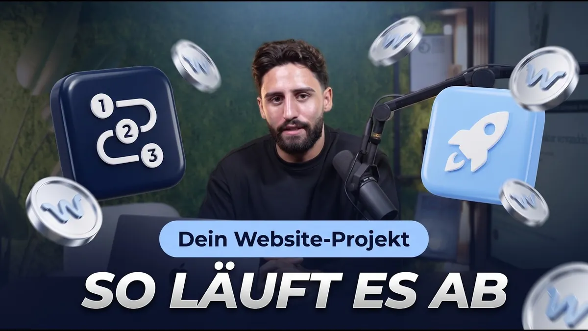
How a website project works with us: strategy before design
3:39
FAQ
Do you have experience with research institutions?
Yes. Among others, we've worked for the Leibniz-Institut, VALO28 and Qarevo. You'll find the projects further up and in our case studies.
How does coordination with many stakeholders work?
We work with fixed milestones and show first design sections early. That way management, communications and project partners give targeted feedback instead of rediscussing everything at the end.
Is an accessible build possible?
Yes. We plan contrasts, font sizes, keyboard navigation and a clean structure from the start. We'll clarify together which requirements apply to your institution.
How long does a project with Webwavers take?
That depends on the scope. After the initial consultation, you get a timeline with fixed milestones before the project starts. That way you always know what happens next.
What happens if I don't like the design?
If you're not fully convinced after the moodboards and the first design sections, you get your deposit back in full. This guarantee has never been claimed so far.
Can't find what you're looking for? Send us a message and we'll get back to you personally.
Ask a questionOther Industries
Also at home in other industries.
Every industry has its own rules. On each industry page, you will find relevant case studies, typical challenges, and our approach.
Start a project
Your research deserves a website people understand.
Tell us briefly what makes your institution or project special and who you want to reach. We'll get back to you with a first assessment of structure, process and next steps.


Guide: research & science
Web design for research and science: complex content made understandable, accessible and easy to maintain.
The essentials at a glance, in 7 chapters. Jump straight to the topic that's on your mind right now.
What a research website has to deliver
Hardly any website has as many different visitors as that of a research institute. Fellow experts look for publications and contacts. Funders and politics want to understand what impact your work has. Companies look for expertise for collaborations, journalists for a press contact, applicants for a feel for the work environment.
A good research website serves everyone without overwhelming anyone with everything. Three principles make that work:
- Structure by questions, not by org chart: Visitors think in topics and concerns, not in departments.
- Core message before technical depth: Every page starts with what anyone can understand and then leads into the details.
- Maintenance in everyday work: The most beautiful site becomes outdated if the editorial team can't update it quickly.
Making complex research understandable
What's obvious to experts is often not understood by outsiders. That's not a problem of the audience but a task for copy and design.
Building content in layers
A short sentence on why the topic matters. A paragraph on how you work on it. Then methods, results and publications for everyone who wants to dig deeper. That way every target group finds its level.
Language that opens doors
Technical terms aren't forbidden, they just need an explanation the first time they appear. Short sentences, active phrasing and concrete everyday examples make even difficult topics accessible. A glossary or short info boxes help without slowing down the reading flow for experts.
Images, graphics and motion
A process, a material or a workflow can often be explained better with a graphic than with three paragraphs. Animations help when they show something step by step instead of just decorating. You can see how we use motion under Motion Design.
Calm, clear design
For the Leibniz Institute for Composite Materials, the design relies on clear layouts, generous white space and a reduced design language. That leaves room for content, and complex topics feel organized instead of overwhelming.
Accessibility: obligation and mark of quality
Public bodies in Germany are required to ensure digital accessibility, at federal level through the BITV 2.0 and in the federal states through their own regulations. This includes an accessibility statement on the website. Whether and how this applies to your institution depends on ownership and funding. It's best to clarify that with your administration or legal department.
Regardless of the obligation, accessibility makes a website better for everyone. We plan these points from the start:
- Sufficient contrast and easily readable font sizes
- Full keyboard navigation with a visible focus
- A logical heading structure and semantic HTML
- Alt texts for images and graphics
- Understandable forms with clear error messages
A frequently forgotten point is PDFs. Reports and publications should also be accessible, or the core content should also be available as a web page. You can read more about the legal basis in our post on the BFSG.
Funders, partners and the public
Many funding programs require funded projects to appear online with a funding notice and the funder's logo. If that's built into the CMS from the start, it happens correctly on every project page automatically instead of being cobbled together for each new project.
At the same time, the website is your most important tool for knowledge transfer. VALO28 connects research, knowledge transfer and social impact. The brand's guiding idea is the path from knowledge to impact. That's exactly the stance the website has to convey: not just showing what you research, but what comes out of it.
- Project pages with goal, duration, partners and results
- A press section with a contact person and image material
- Events and news that show things are moving
- Clear paths for cooperation inquiries from industry
Spin-offs: from institute to company
Spin-offs face a different task. They have to convince investors, customers and partners who aren't experts, while keeping their scientific credibility. A distinctive brand that combines credibility and innovative ambition helps here. For Qarevo, a digital health platform, we created an identity that brings together medical credibility with the ambition of a modern healthtech platform. The typeface was chosen to stay easily readable even in complex interfaces and at small sizes.
Multilingual content and maintenance by the editorial team
Research is international. An English version is therefore usually part of it, and a complete one rather than a half-translated copy. Each language gets its own URLs, its own SEO settings and a clear switcher.
At least as important is the question of who maintains the site after launch. In many institutions, that's a small communications team that looks after the website alongside press work and events. That's why we build the CMS to fit your content:
- Collections for news, projects, publications, team and jobs
- Templates in which the layout stays stable even with long titles or many partner logos
- Personal training at launch
If you want to hand off ongoing maintenance and updates, you'll find that in our maintenance service.
How we work with many stakeholders
Management, communications, departments and project partners: website projects in research have many voices. To keep things from dragging, we work with fixed milestones following our process.
- Initial consultation and onboarding: Goals, target groups, content and requirements such as accessibility and languages.
- Structure: We sort projects, topics and target groups and develop the navigation.
- Moodboards and first design sections: Visible early so everyone gives targeted feedback instead of rediscussing everything at the end. If you're not convinced after that, you get your deposit back.
- Design and build in Webflow: Fast, responsive and with a CMS for your editorial team.
- Launch and training: With redirects so old links keep working.
How much time do I have to invest myself?
We keep your effort as low as possible. You're involved at the decisive points: briefing, approvals and final feedback. We take care of the rest.
Are there ongoing costs after launch?
Yes, for hosting and platform licenses, for example the Webflow site plan. If you want to hand off maintenance, updates and further development, there are our growth packages for maintenance, SEO, GEO and conversion.
Checklist before the project
These questions help with preparation. Whatever is still open, we'll clarify together during onboarding.
- Which target groups are most important, and what should they do on the website?
- What content exists today, and which of it is outdated?
- Which requirements apply: accessibility, funding notices, the corporate design of your parent organization?
- In which languages should the website appear?
- Who maintains the site after launch, and how much time is available for it?
- Who decides and gives approval?
How a relaunch works step by step, you can read in our guide Planning a website relaunch.